The Klner design language
Make room for a cleaner kind of life.
Warm, capable and beautifully uncomplicated. One shared language for the website, the app and the people behind every clean.
Klner




The Klner K.
Our original symbol: a soft, upright stem and two rounded leaves. Familiar, simple, and easy to recognise at a glance. Use the complete lockup where the name matters, and the mark alone when space is limited.
Give it room
Keep at least half the mark’s width clear on every side. Never stretch it or add effects.
Keep it legible
The mark starts at 24 px. Use the supplied icon tile for home screens; transparent assets are for layouts and print.
One quiet signature
Forest on paper. Paper on forest. Keep the mark and wordmark together in one colour.
Nature, with a clear purpose.
Forest makes the next step easy to find. Warm paper gives everything space. Sage adds softness without getting in the way.
Forest#174C3CAction & identity
Ink#20332BWords that matter
Sage#EAF1E8A soft place to land
Paper#FAFBF8Room to breathe
Muted#6B746DSupporting detail
Clear words. A lighter touch.
Good to come home.
Instrument Sans brings a modern, human voice to the web. Native system typography belongs on iPhone and Android, with the same calm hierarchy.
Display / 44–84 px
More living.
Heading / 22–32 px
Your kind of clean.
Body / 15–17 px
A familiar company, a useful plan, and a little more time for you.
Use lighter weights for generous headlines, medium weights for decisions, and comfortable line spacing for details. Small text still needs contrast and enough size to read.
Familiar at every step.
A home, thoughtfully cared for.
Simple cards pair useful information with one obvious next step.
Your cleaning guideExample status: your local draft is saved.
Preview estimates are clearly identified before anyone makes a decision.
Example error: choose a date to continue.
A breath between things.
Space
Use a 4 px spacing rhythm, with 24–32 px inside cards and generous separation between sections. Group related information; give each decision room.
Shape
Compact controls use 8 px corners and at least 44 px touch targets. Surfaces use 12 px corners. Glass belongs to supported native navigation and controls, with readable opaque fallbacks.
Motion
Small, purposeful transitions help explain a change. Respect reduced motion and reduced transparency. Never use animation to hide a wait or invent progress.
Homes you can almost exhale into.
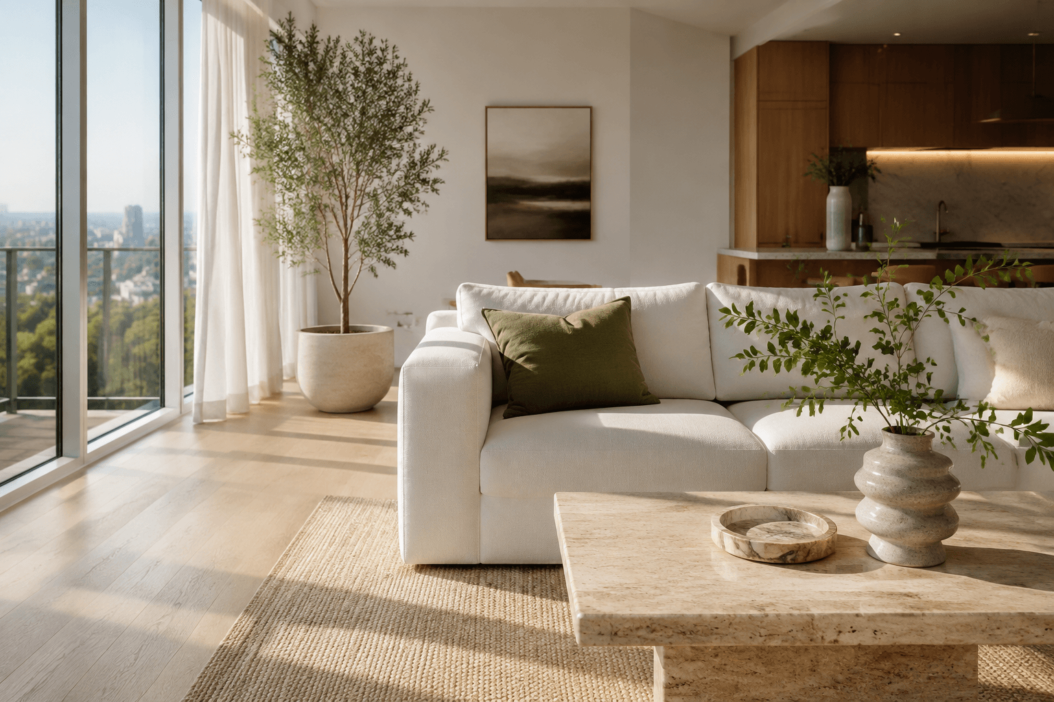
Warm daylight. Natural textures. Homes that feel lived in and cared for. Photography brings feeling; service details bring confidence.
Generated interiors can illustrate the brand. Generated people must never stand in for real cleaners, customers or testimonials.
Phosphor icons on web. Familiar native symbols where the platform calls for them. Icons support words; they do not replace essential labels.
A familiar face. A thoughtful fallback.
Recognisable at any size
Use the same portrait on the team card, in a cleaning plan and in the workspace.
Always optional
A soft sage silhouette carries our K symbol when someone has no photo. Keep the same space and shape when a photo cannot load. Never substitute a generated face for a real cleaner.
A company you can recognise.
A framed company icon sits over the cover photo and follows through to the profile. Sample companies have illustrative marks; other companies use an icon made from their name’s initials. Keep company identity separate from service and verification badges.
Kind. Clear. Grounded.
Say what happens
“Save my cleaning plan” when it saves a draft. “Your request was received” only after the server confirms it.
Make care concrete
Name the company, show the scope and explain the price. Trust badges need real evidence and an honest description of what was checked.
Let everyone in
Visible focus, readable contrast, clear labels and generous touch targets. Test keyboard navigation, screen readers and larger text on real devices.